Making time for JOY – An Artist's Exhibition Pays Tribute to Design
By BIANCA BOVA
Jason Pickleman began painting in the 1980’s. His earliest body of work, the Prefix and Suffix paintings, addressed the plasticity of language and its inherent relation to visual abstraction. The works served as formal investigations as well, with the artist noting, “At the time I was making these works, I really just wanted to know what paint does. I was very much involved in the Chicago-base Conceptualist group, many of whom were using language in their work and that influenced me in making this series…at the same time, I was beginning my career as a graphic designer, and developing an interest in typography.” Some forty years on, Pickleman is still producing paintings that ask us to consider the ambiguity of language; to pay attention to its implicit and explicit meanings; to consider the significance of its form.
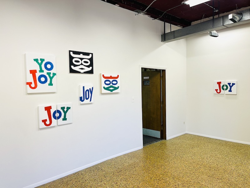
Making time for JOY, currently on view at The Suburban, consists of nine new works derived from various iterations of the logo for the dishwashing detergent brand Joy, originally conceived of in 1949 by the legendary American designer Donald Deskey. Pickleman isolates the logo, then treats it as a material, splitting, flipping, and wrapping it, while faithfully maintaining the integrity of its original form. Rather than coming across as a manipulation of Deskey’s work, the works read as an homage.
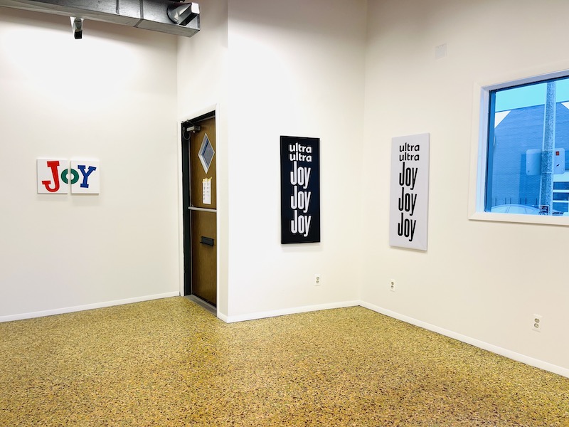
There is an inherent Pop quality to the logo itself, and to Pickleman’s treatments of it. Two works on outdoor-rated vinyl, ULTRA ULTRA JOY JOY JOY (black on white) and ULTRA ULTRA JOY JOY JOY (white on black) radiate a compulsive energy, while YO JOY (mottled; blue O) has a sly playfulness and irresistible graphic kitsch about it, while also showcasing Pickleman’s masterful paint handling.
Two diptychs, JOY DIVIDED (green O, diptych) and JOY DIVIDED (blue O, diptych), each bear the logo bisected vertically across two canvases, separated by an approximately two inch gap. While no less visually buoyant than the other works in the series, these two pieces hint at what the logo belies. Consider the environment in which we might naturally encounter it: the epicenter of the home, the kitchen counter. The divide in the logo transgresses the notion of domestic bliss the brand name implies, the way a smile stretched too thin conveys displeasure more explicitly than the absence of a smile; not authentic joy, but a performance of joy for the sake of appearances. What would the neighbors think?
JOY FLIPPED (full color) and JOY FLIPPED (white on black), each featuring mirrored iterations of the logo, are perhaps the most ambiguous paintings in the series. The result is an undeniably mask-like form, talismanic and uncanny. It could be interpreted as a cave painting as easily as a death mask, calling to mind Pickleman’s Icons series (which includes Hand Heart (2021) and Hourglass (2020) among others), and his talent for inviting reassessments of the enduring symbols of humanity.
Centered on the salon-style main wall of the exhibition is the most diminutive and most stunning of the paintings, BLUE JOY. Utilizing a version of the logo from the 1990’s, the letterforms dynamically fill the volume of the canvas, the “J” and the “y” wrapping cleanly around the outer edges. This single gesture is Pickleman at his best as an artist, intervening with extraordinary precision while respectfully maintaining the source material, to deliver a work that is unmistakably his own. It is the heart of the exhibition.
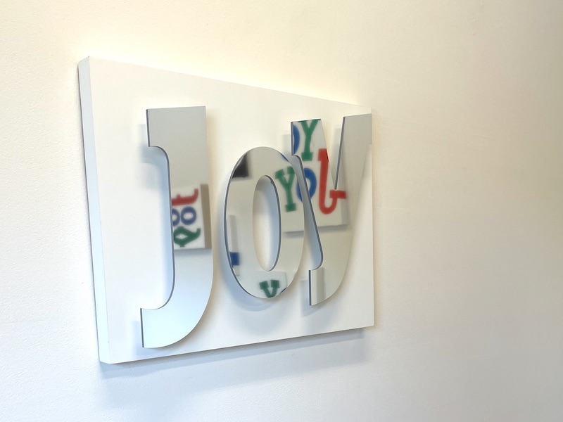
The only quasi-sculptural work, SILVER JOY, hangs on a separate wall, apart from the paintings. Composed of silver acrylic letterforms that seem to float on their mounts on gesso board, its reflective surface captures, at turns, the viewer, the space, and the companionate works in the exhibition. Few are those who can resist playing in its presence, striking a pose, snapping a selfie, or simply feeling the need to move around the work to get its full effect. With irresistible charm, it brings Pickleman’s dictum to “make time for joy” into practice.
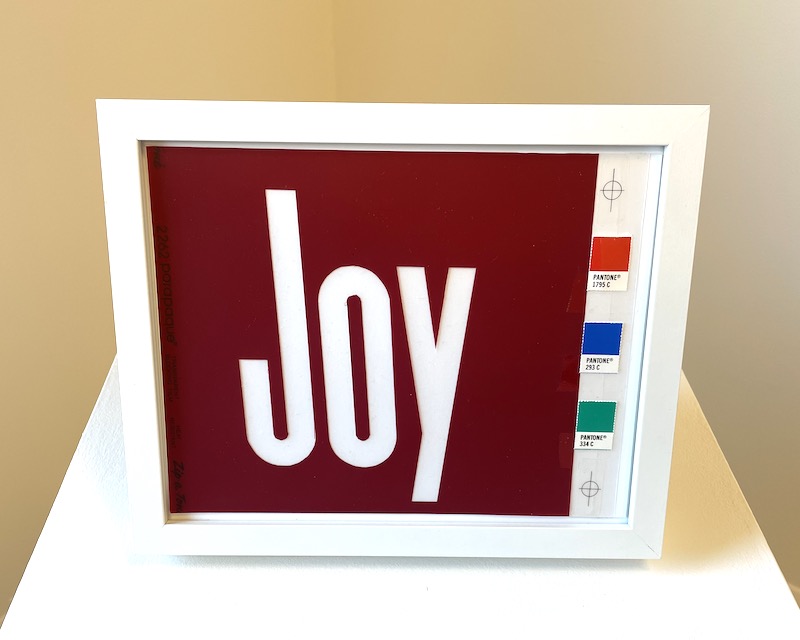
Tucked in a corner of the gallery on a pedestal is one final work, though one not found on the checklist. It consists of a framed sheet of Parapaque with the Joy logo cut out, alongside the logo’s three corresponding pantone swatches, with two registration marks drawn in. When asked about it, Pickleman acknowledged that he wanted to underscore the graphic design roots of the work, and added, with a grin, “I wanted to see if I still knew how to do it, too.”
Pickleman, of course, was the proprietor of the studio JNL Graphic Design for over 30 years, having only recently closed his doors. His notable clients (including museums, artists, restaurants, hotels, and galleries) are too numerous to name. That Pickleman chose to respond to the work of Deskey is made all the more intriguing when his own career is considered. Along with Joy, Deskey was also responsible for the now-iconic logos of Crest toothpaste, Tide laundry detergent, and Jif peanut butter, sympathetically, among Pickleman’s most well-known commercial designs is the logo and packaging for the wildly popular popcorn brand Skinny Pop.
Once, as he gamely accompanied me on an errand in my favorite grocery store, Devon Market, Pickleman remarked on his dislike of grocery shopping.
“Someone designed every item in this store. There are so many decisions sitting on these shelves,” he lamented.
Making time for JOY pays respect to those decisions, to the designers and artists whose legacies surround us. For Suburban owner Michelle Grabner to invite Pickleman to exhibit this body of work in a gallery whose previous exhibitions include those by Luc Tuymans and Wade Guyton places him squarely where he belongs: in the canon of great contemporary painters who have devoted themselves to excavating the residue of daily life to illuminate its most intimate corners.
Making time for JOY is on view through August 31st, 2023 at The Suburban, 723 S. 5th Street, Milwaukee, WI. For more information visit thesuburban.org