Book Report: Ray Johnson c/o

By JASON PICKLEMAN
It’s a wonderful thing that museums continue to create well-produced exhibition catalogs. Blockbusters come and go, but what remains after these shows are gone are the collected photographs, images, and essays reproduced, printed and bound in the volumes that carry the exhibition title. To that end, I present for your consideration Ray Johnson c/o, a marvelous monograph available in advance of the exhibition at the Art Institute of Chicago of the same name.
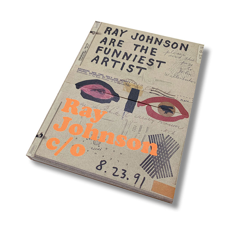
Edited and curated by Caitlin Haskell and Jordan Carter, Ray Johnson c/o measures 9-inches wide, 12-inches tall, and has a spine width of just more than 1-inch. With a soft cover, artfully folded, the 376-page body feels casual in the hands thanks to the recurrent use of a kraft-color text weight sheet (possibly 70#) that is gently textured on one side, but smoother on the other. It is interesting to note that the images printed on this paper have different levels of clarity and snap depending on which textured side the work is reproduced: just look at the differing density of the black ink on pages 6 & 8, for example. Not that this matters, as Johnson’s work only rarely relies on reproductive verisimilitude. Suffice it to say, the kraft-colored pages give the catalog the air of a vintage store find, a retro suggestion of aged paper and graphic pluck.
What is not printed on this kraft paper is printed on an uncoated natural white text weight sheet (possibly 80# with modest show-through). These two papers alternate every 8, 16, 24 or 32 pages creating the visual equivalent of skip and hum. I mention this because the experience of looking at this book is constantly framed by this design decision. The kraft colored pages are mostly dedicated to vintage-looking reproductions of Johnsonian ephemera: letters, collages, drawings, envelopes—the remains of an epistolary exchange. The natural white text pages contain twenty-one short essays, easily digestible, and amounting to a veritable “Ray Johnson Reader”, which, in total, present a strikingly spot-on overview of one of the most wily artists of the 20th Century.
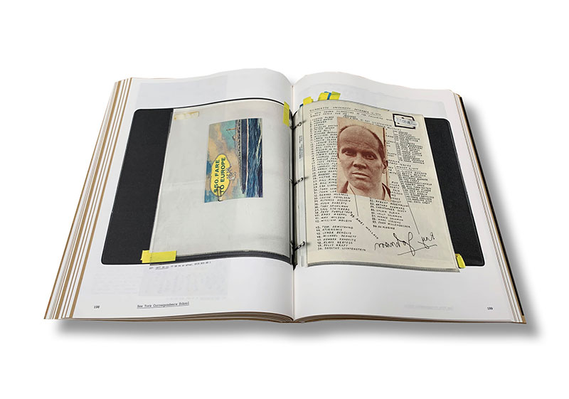
The book and exhibition chronicle the 55 year artist-collector relationship between Johnson and his patron/archivist William S. Wilson (commonly referred to, and written as: Bill). The collection spans many thousands of works which were painstakingly saved, filed and inventoried by Wilson. Organized into a series of more than 175 three-ring binders containing transparent plastic sleeves, the collection has entered the Art Institute of Chicago’s permanent collection and will be on view this November. The exhibition in the Modern Wing promises to be an eye opening affair luxuriating in the flotsam and jetsam of aged paper, hand-addressed envelopes, canceled stamps, and cheeky turns of phrase.
Johnson’s artwork is all play. Suggestion, innuendo, and mischief seem to be Johnson’s creative repartee. Conventional images are often captioned or titled in such a way as to develop new readings, often sly, humorous, or tawdry. Along with an ever-growing cadre of personal glyphs (bunnies, ducks, snakes, buttons, phalluses), Johnson détourned the most conventional source material into the equivalent of visual koans with attendant instructional dictates.
Though he showed with the New York gallery Feigen for many years starting in 1967, the bulk of Johnson’s artistic practice skirted the gallery market place; he seemingly preferred mailing his art to friends and colleagues in lieu of pursuing substantive exhibition opportunities. Fabled stories circulate of Johnson’s reluctance to give his gallerist-admirers the pleasure of exhibiting his work. Often, given the opportunity to exhibit or perform, Johnson would produce what he called “a nothing”, and often mistaken as such.
The book, Ray Johnson c/o, was designed by Irma Boom, a rock star in the world of exhibition catalog design. When you go see the Rolling Stones you don’t tell Mick Jagger how or what to sing: he can sing whatever the hell he wants, because he’s Mick fucking Jagger. Likewise, if you hire Irma Boom to design your exhibition catalog, you let her do whatever the hell she wants. She’s Irma fucking Boom. For the most part, the team behind the Ray Johnson c/o catalog has given Boom full creative license to interpret and present Johnson afresh. With that freedom, she has delivered a catalog that is gallopingly eccentric, and novel in a thoughtfully sensitive manner with an artistically commiserate wit to keep up with the creative dexterity of the book’s namesake. The catalog is beyond excellent. You should buy one immediately. I paid $60 for mine.
Stylistically, the book is adventurous, with graphic conventions nudged throughout: eliminating the use of italics in favor of underlining being one such example. This is the sort of graphic intervention that only a supremely trusting client can foster through the arduous nit-picky process of book production. Everybody always says they want something different; that is, until you show them something different—at which point, most clients turn tail and assume the dictatorial role of conservative editorship. Not so with Ray Johnson c/o. The book layout is awash with odd column arrangements and irregularly placed image reproductions with captions at custom angles relating to the frequently unusual shapes of Johnson’s hand-cut and torn visuals.
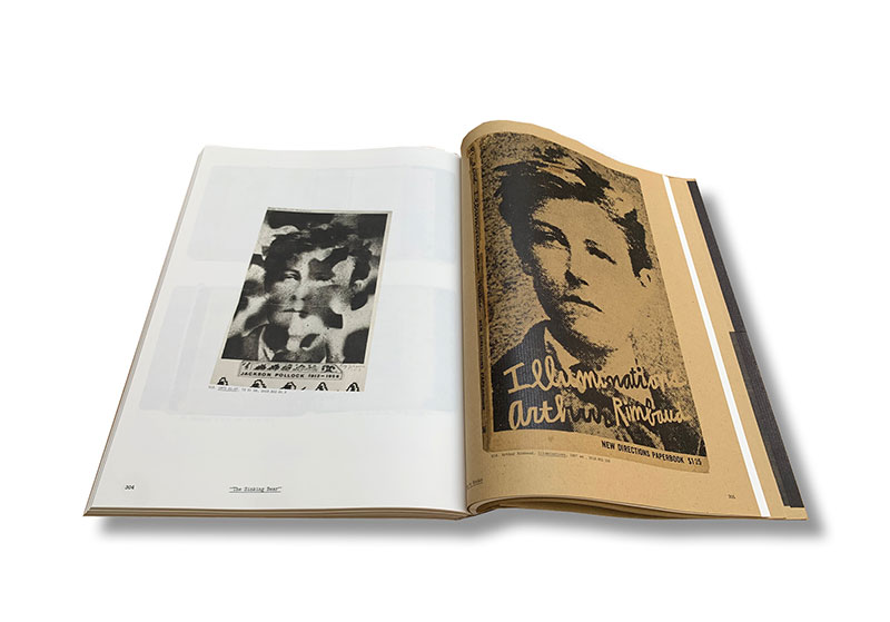
On a personal note, I’d like to commend the curators and editors for the inclusion of many examples of Johnson’s earliest commercial design practice. Letterhead announcing “Ray Johnson–Graphic Design” and examples of book cover designs for New Directions Paperbooks portray Johnson as someone determined to bring a stamp of personal artistic touch to client-directed projects. How many of you as angsty teenagers had a copy of Arthur Rimbaud’s book Illuminations, with the poet’s serious, side-ways gazing, black and white, high contrast portrait egging you on into artistic admittance. Well, you can thank Ray Johnson for the cover, a 1957 commercial design job. Dare I say, the dot screen, color and demeanor of the Rimbaud portrait could almost be mistaken for one of Andy Warhol’s 1964 Most Wanted Men. Warhol and Johnson were good friends, so one can only wonder if Warhol cribbed the style of Johnson’s Rimbaud portrait for his own pop use.
Many of the reproductions in Ray Johnson c/o are photographs of the 3-ring binders organized by Wilson and splayed open to various 2-page arrangements (what Boom calls “Bill’s collages”). Wonderfully photographed by Amy Kaczmarek with a dead-pan clarity that includes stray post-it notes and additional hand-written adhesive labels, these documentation photos are clinical but personal—the work of a cold-blooded archivist. The binders are the key to understanding the exhibition. The order and the sequence of images contained within the binders was not dictated by the artist, but by the collector and archivist: Bill Wilson. Without Wilson, there is no Ray Johnson c/o. In this light, Wilson can be thought of as a collaborator and enabler of the artist—a patron of the highest order. Whether money between the two men ever changed hands I don’t know, but nobody continues a 55-year artistic project with another person without the involvement of a far more radical currency: love.
The cover of the book is a marvelously tactile collage of Johnson’s greatest hits. Technically a glued-to-the-spine, uniquely folded dust jacket, the cover sports a spot orange ink (most likely Pantone 021U) that I have on good word was not originally specified by Boom. Rumor has it that Boom wanted the name of the show (set in sentence case Cooper Black) to print in black ink; but the book’s distributor, Yale University Press, got worried that the book-buying public wouldn’t recognize and differentiate the typeset title of the book from all the other graphic language of Johnson’s artwork that is also reproduced on the cover. Boom lost this one creative battle. The book title is printed in orange ink, not black. [Hey, Mick: play Sympathy for the Devil for me.]
The book’s underlying architecture is that of a 4-column grid that is adaptable into both 2-column and 3-column variations. Set in a typewriter-like font, the text is large and easy to read, with ample word spacing creating text fields that are visually steady even when line lengths get short owing to weirdly-placed inset reproductions of Johnson’s art. Folios are indented from the outer margins. Double hyphens are used in place of em dashes. Two spaces separate sentences. Attention to these conventions matter, as the sum total of them are what gives any book its character, charm or heft. Ray Johnson c/o, the book, comes off as warm, approachable, and lovingly researched and reported—the furthest thing from “fussy” the Art Institute of Chicago has ever produced.
Ray Johnson c/o, at the Art Institute of Chicago, Nov 26, 2021–Mar 21, 2022
Jason Pickleman is an artist and graphic designer in Chicago. He has produced graphic identities for EXPO Chicago, Millennium Park, and the Museum of Contemporary Photography. His professional design work is in the permanent collection of the Art Institute of Chicago.