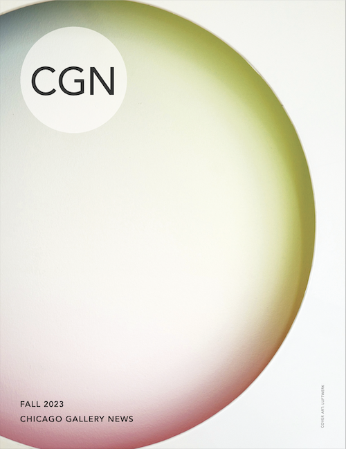
Light Over Light: Petra Bachmaier and Sean Gallero of LUFTWERK

Note: This is the fall 2023 CGN Cover Feature from our Sept–Dec magazine. To subscribe to the print version please click here.
By ALISON REILLY
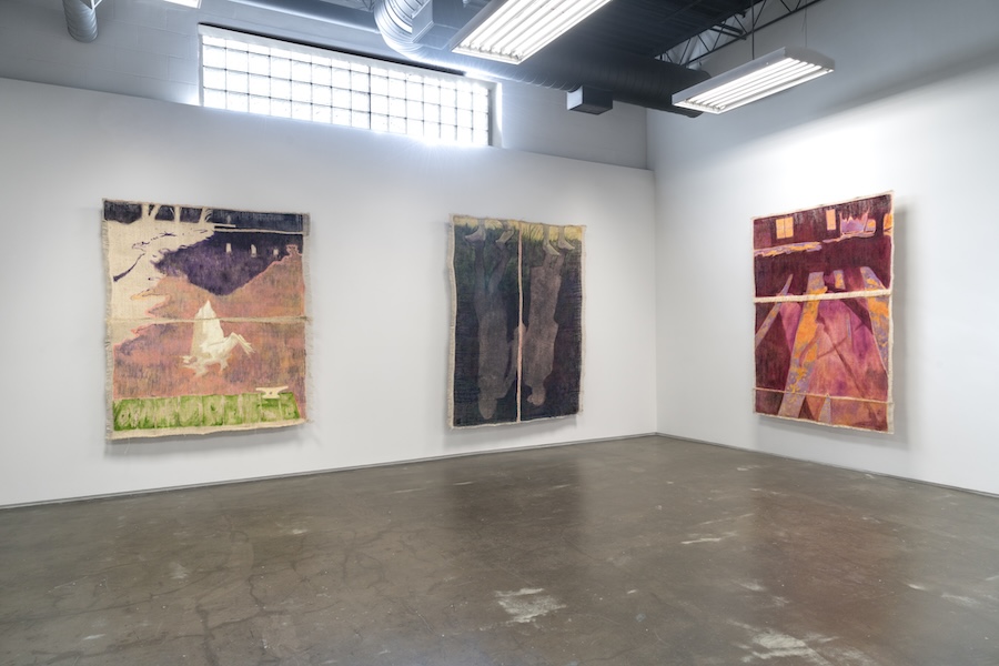
In advance of their exhibition Light Over Light opening at Volume Gallery in West Town this November, I spoke with Petra Bachmaier and Sean Gallero, who make up the artistic duo, Luftwerk. The two generously shared insights about their history as artistic partners, their process for designing large-scale interventions at architectural icons like Frank Lloyd Wright’s Fallingwater and Farnsworth House, and how they have moved from using electric to ambient light in their installations.
CGN: How did you become collaborators and what, as artists, attracted you to each other?
Petra Bachmaier: We met many, many years ago at the School of the Art Institute of Chicago.
Sean Gallero: Nearly 25 years ago. It was 1999.
PB: We were both in the performance art department, so the idea of experiencing art as life was really prominent. We started to collaborate almost immediately.
SG: We were drawn towards the installation component of performance art, creating environments for people to experience. Whether moving images through Super 8 or a still image through side projectors, we created these environments.
PB: Transformative environments—taking over familiar spaces and transforming them temporarily—became our mode of operation. We removed ourselves as a live element within these scenarios and created spatial takeovers. Because we are in Chicago, we were inspired by architecture and worked closely with two Frank Lloyd Wright buildings for installation-based work. We also ventured into a dialogue on the architecture of Mies van der Rohe. Doing these temporary interventions with architectural landmarks informed how we think of shaping spaces, shaping sculpture. It informed what we do in our studio practice.
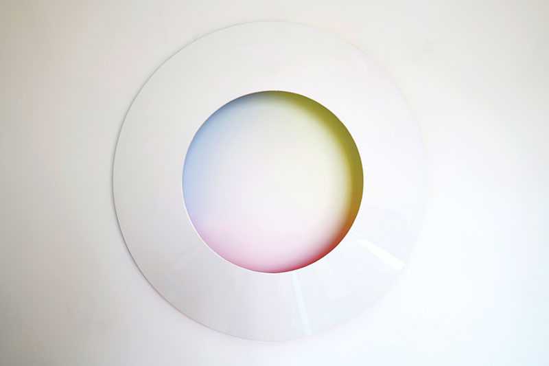
SG: Our work evolved from performance to performance installation. We’ve done a lot of video in the past, so these engagements with architecture always had this element of projected light, whether it’s video lighting or slides. We always transformed the environment through either a moving image or static image. And then the building became the canvas, transforming that whole philosophy of the architecture into a bridge between the historical context, whether it’s Frank Lloyd Wright or Mies van der Rohe, to more contemporary media, projection, moving image. Now we’ve taken all that and started creating our own environments through color and lighting. We’re constantly shifting. The show at Volume is capturing light and color but also projecting it and not using any sort of direct lighting, using ambient light and sculpture to capture the essence of what these buildings feel like.
PB: While we’ve been working on all of these architectural projects, we got interested in the Light and Space movement. We felt very much akin to it. For us a video projector became a light source. From this idea of illumination, we focused on using light as both a pure tool and material.
CGN: What were your own individual artistic practices like before you met during graduate school?
PB: I enjoyed the idea of Dada and Fluxus. I grew up in Germany, and I was intrigued by non-traditional art practice and very interested in sculpting with materials and light in installation-based forms. I studied predominantly in Hamburg, which is a conceptual art school where there were Fluxus-based instructors. When I got to SAIC I began to ask, “How do you reduce material use? How do you work with material in a minimal way?”
SG: We’re always learning new things within our practice. We’re not afraid to jump into the void to be more creative. I come from more of a fine arts background, painting and drawing, but at SAIC I also jumped around, starting in Visual Communication, then working my way to the digital realm, then printmaking, and finally in performance art. It was very exciting in the ‘90s and early 2000s, when performance art was hot in Chicago. We did ad hoc guerrilla performances everywhere. That’s how we crossed paths—I came from a visual standpoint and Petra from the more experimental. Even in the studio, those two converge and we bring our own skill set to a project or piece of artwork. We each have our pluses and minuses, but we always reach a harmonious conclusion after some debate and some tension. Especially with color, there is a very democratic way of choosing color in our studio. We have our favorites and dislikes.
CGN: What has been one of your most rewarding experiences working with an institution? And most challenging?
PB: The Chicago Cultural Center has been a home base for us for over a decade. It’s a Chicago-based curatorial program and that has helped our practice really grow.
SG: One of our highlights was Frank Lloyd Wright’s Fallingwater. That was our second step into Wright, and experiencing Fallingwater is breathtaking. How do you create an intervention within architecture that’s already a masterpiece? We had the wonderful challenge of celebrating the form, function and natural landscape of Frank Lloyd Wright. For six nights we had the house to ourselves to be explore be intimate with and create our art.
CGN: For a big, ambitious project like that, how do you get started and work through that?
PB: Usually it starts with a site visit. The curator hands over site plans, and we dive into the story. We want to inform ourselves where are we sited, the context of the place, and ask, “How does the work we do find a dialogue within that framework?” Working with institutions, it’s a collaborative exchange. “What does the institution stand for? What are they preserving? And how does our work live in dialogue to that mission or vision for a place?” It’s often about how do we draw new ways of looking at these places that actually hold valuable cultural assets. Everybody knows Farnsworth House, for exampe, but when you try to see it in a very different way you can read a totally different context. So we create a new way of experiencing something that we think we might know because it’s been written about for 50 years.
SG: There’s a lot of research involved, whether it’s scholarly research or even just asking the groundskeeper, “What do you notice? What do you see? What’s this detail? What’s the overall experience of a place?” We look at details, then the whole philosophy, and we ask what was there before. These environments hold so much information and knowledge that we could be inspired by a river or by a set of trees.
CGN: Could you talk about your study of the passage of light, your effort to capture light throughout a day? How did you become interested in that and how is it present now in your work?
PB: Oh, it’s very present in our work.
SG: For the longest time we worked in artificial light—projected, electronic, digital light. We did an exhibition at the Garfield Park Conservatory at their greenhouse. We wanted to create an installation that was experienced throughout the day.
PB: And activated by the sun. Learning how sunlight travels, observing it far more closely became an interesting phenomenon to be more aware of. It happens every day, but how do we play with it? How do we shape with that phenomena and also the qualities of light and color, the intensity of different colors in the sky. All of that informs of how we work with color and light.
SG: One piece at Garfield Park Conservatory dealt with plants and how they absorb light in the color spectrum. We used the green and red ends of the color spectrum. One signifies movement and growth. We had a canopy of blue and red acrylic gels. The sun would move throughout the day and the pattern would be reflected on the floor. And so we physically saw how the sun affects color and movement. That informed how we could create work that uses ambient light, natural light, as well.
CGN: An installation you did at Cheekwood Estate and Garden in Nashville included colored light and canvases together in the room. To me it brought together different artistic practices and art histories. How did you start using canvases in your installations?
PB: For our previous exhibition at Volume in 2020, we experimented by using color as a canvas for the light. How does light impact the way you perceive color? As Josef Albers explains, if you illuminate the color red, it’s more red than if it’s not illuminated. And so the exhibition in 2020 was based on this idea of color as a canvas.
SG: We’re distilling our process here. We’ve come from the digital realm, where even sometimes the canvas is digital, but now we’re looking at how do we achieve the purity of color through paint and pigment? How do we apply gradients to canvas or apply solid material that’s textural onto canvas? We’ve done the process of creating pigment through powder and then using hide glue and all these emulsifiers to create the paint. We experimented with airbrushing and how we get gradients of color that are affected through light. Now we love color, we love light. How can we use the pure sense and source of lighting to create our own canvas of color? We’re stocking up on paint and pigment to create that experience.
PB: It does feel a little bit like color field painting, but it’s actually about the interaction of color with light. What we set up in the studio is very much the interaction of how those two create an interesting tension or visual field that can shift your perception. The canvases that you’re referring to, they’re titled Meadow, have a gradient from yellow to green based on the idea of bringing the outside in. It was informed by the green and the garden, the light. It was a very simple color field, a smooth gradient. Once we illuminated the light from the yellow, the dark of the green, they have an ebb and flow where they shift. All of a sudden the whole canvas is dark and then it kind of emerges into light again. It’s very perceptive. You need patience with these works. They ask you to take time and look.
SG: We need patience because we’re actually cultivating the color. We’re collecting grass, botanic material. We dry them out, crush them, pulverize them, bring them to a powder, and then we create paint or ink from that and apply it to the canvas. There’s another level of the art making process where paint sometimes comes out of a jar, but we also create the paint, create the texture, and create the canvas through this organic material.
CGN: You’ve talked and written about the taxonomy of colors and your own studies of Werner’s Nomenclature of Colours. How did you start looking into that? And why has that continued to capture your attention?
PB: We stumbled upon it, though we have always been interested and informed by color theory. Most artists cannot avoid it.
SG: To Albers it was color with emotion and intellect. But with Werner it was about creating a system of finding colors in nature and determining how we put it into a nomenclature, a code, a dialogue that connects it to the natural environment. It was very interesting to see this pre-Pantone system based on nature that you could find–plant material, mineral and animal —feathers, petals and rocks.
PB: Then you dive into the artistry of painters who created their own paint from these materials. They still carry the name, for example, burnt sienna. We’re building a relationship with the actual material. We’ve become enamored with this nomenclature and going back into history when color was not numbered and was not a marketing language, but actually developed by someone who created a system for us to understand the visual world around us. People were more connected to, “Oh, it’s sky blue!” It sounds different than cyan.
CGN: Tell me about your show at Volume Gallery in November and how you’re thinking about it now.
PB: This is our third exhibition with them. For the first two, in 2018 and 2020, the exploration was all about the phenomena of color and interaction with electric light.
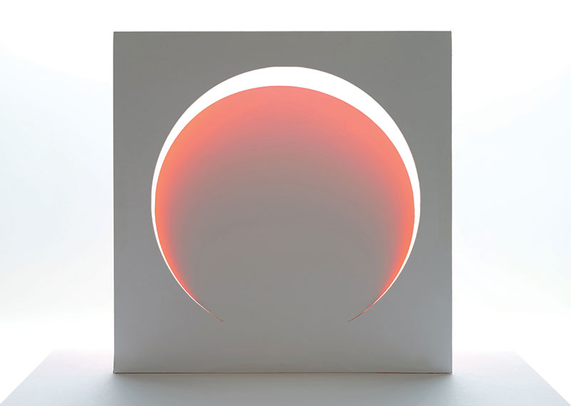
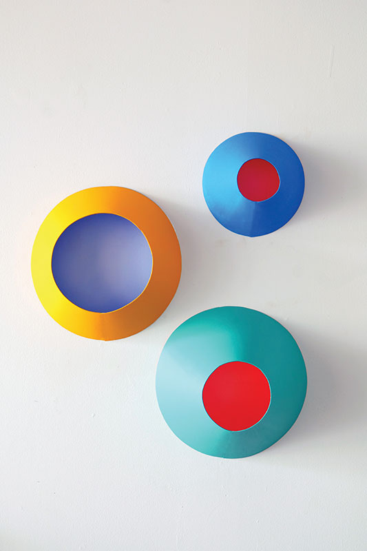
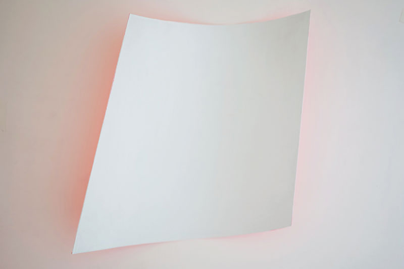
SG: But this show coming up is about the pure property of color and how it interacts with ambient light. We’re still designing the room. We’re looking at more minimal sculptures but with these subtle hints of color that reflect onto the wall, onto the environment. It’s about getting accustomed to a space and getting your eyes readied and then looking for those subtleties or vibrant reflections. It’s about sculptural material that reflects color.
PB: The color itself bounces or reflects its light quality. It’s like sculpting as if we would sculpt light, but it’s actually for the color. It’s a departure for us to think that nothing within the main gallery will be plugged in. It will be all sculptural and wall-based. It’s kind of like chasing an aura for color.
#
Light Over Light: Petra Bachmaier & Sean Gallero of Luftwerk Studio
At Volume Gallery, Nov 3 – Dec 16, 2023
To subscribe to the CGN Fall issue in print click here.